Read all about our new fresh look from our very own UX/UI designer.
Background
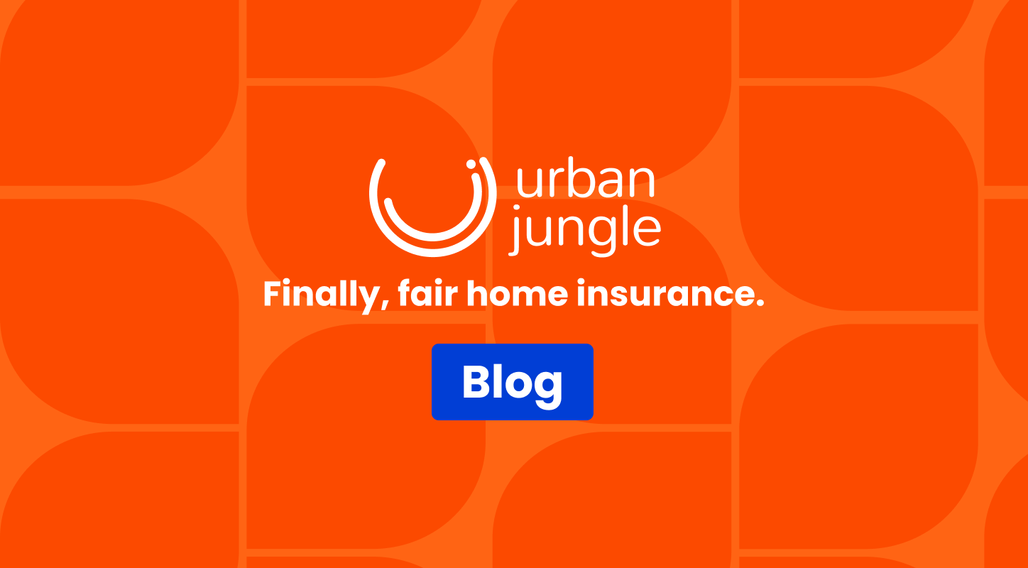
Urban Jungle is shaking up a traditional insurance industry by building fair and simple policies for a new generation of customers. We make it much clearer, easier and more affordable to insure the things you love the most.
In 2019, we found ourselves with two colour schemes. Orange and blue were our core colours, but they weren’t unique enough for a tube advertising campaign. We worked hard with a marketing agency and decided to introduce a green and pink colour palette to give us a distinctive edge on the tube. With the tube campaign fast approaching, we focused our time and energy on executing the new look to a high standard, but our website didn’t receive the full visual re-brand it needed; we were left with a two-visual-identity-kinda-thing.
With our customer base growing, and our reputation accelerating, it was time to define our visual identity and pull all channels together.
The Process
We kicked off the visual identity process by establishing which of our current brand elements we were attached to and wanted to retain. We learnt that we were happy with our brand messaging and personality, loved our logo and felt that orange was very much Urban Jungle’s colour. Our direction was to revamp our visuals to match our friendly, techy, trustworthy selves.
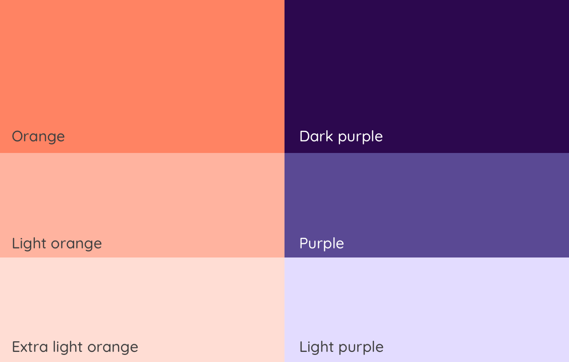
Orange
Finding that perfect shade to define your company is a vital challenge. We knew we wanted to stick to orange as our hero colour, but we needed to give it a refresh. After meticulously playing around with all shades of orange, we settled on one we’re pretty chuffed with.

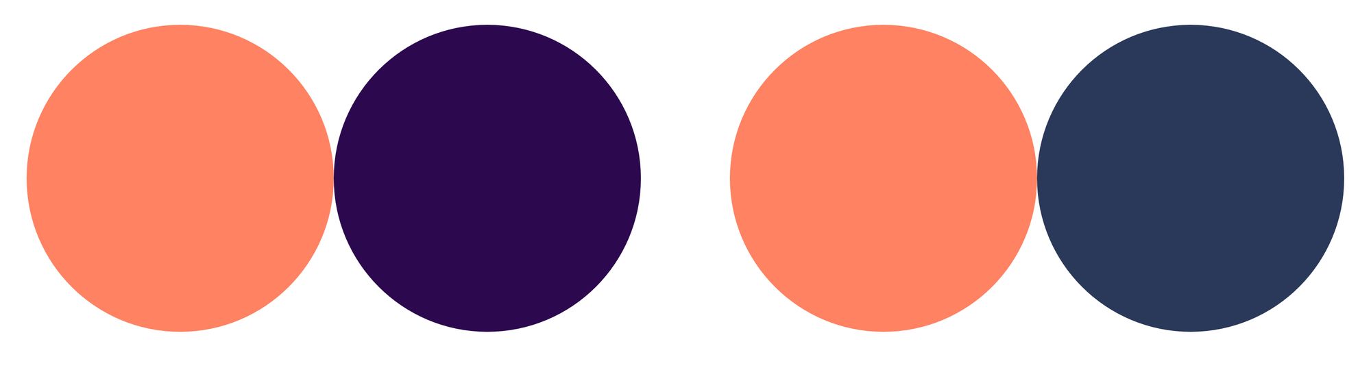
Extending the palette
Every hero needs its sidekick, so we set off on the mission of finding a colour to bring the best out of our orange. After playing around with every colour combination possible, and making countless mock-ups, we whittled it down to two colour schemes to share with the stakeholders.
When developing the colour palettes, it was effective to apply the schemes to a variety of our web pages and marketing materials, to ensure that it allowed us flexibility and creativity. Top tip: be sure that you’re confident that you can work with the colour scheme before pitching it!
We took a look at our traditional insurance competitors and found darker deeper colours like blue, green, red and black as dominate visual identities. As a challenger brand, we also want to stand out visually, so we adopted new, fresh colours, which reflect our simple and smart insurance. After much deliberation, fuzzy eyes, and a lot of “let’s take a step back”, we decided on orange and purple and we’re really proud of what it represents.
Font
Fonts have a huge impact on an overall impression of a brand, more so than you might think. We wanted our font family to reflect Urban Jungle’s personality; something friendly and easy to get on with. The process involved scrolling through font families online, downloading potential candidates, and applying them to our website and marketing material to see how we might use it on site. To cut a long story short, we settled on Quicksand to be our friendly and versatile font family, and we love it!
Imagery
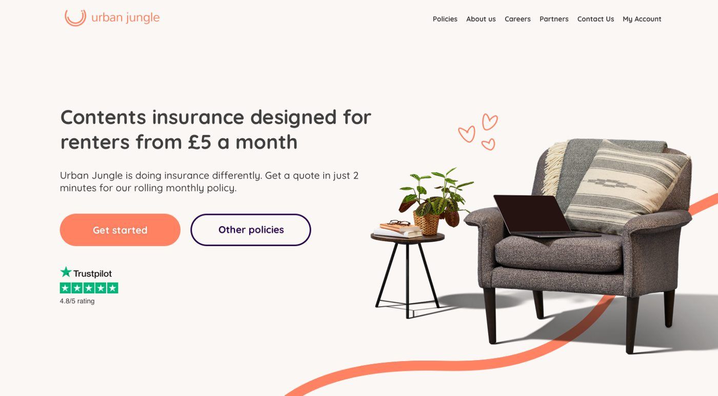
Our goal with imagery was to refine our style and ensure the imagery could be easily applied across multiple platforms. We wanted our imagery to showcase items that people love in a relatable way. We toyed between illustration and photography internally and decided to create a bank of photos, which would represent people’s stuff at home.
We knew an important part of this project would be to find great people to work with and help execute our vision. We found Creative Content Specialist, Meryl Singleton, and Photographer, Nick Dunne who were both a dream to work alongside; we now have a collection of images, which are consistent in style, and flexible in application.
Our new look
After a final decision on the colour scheme and iterations on font and imagery, we now have a visual identity we’re proud of!
Written by: Hannah Godfrey, UX/UI Designer at Urban Jungle